What is the global budget for healthcare? How does it compare to the size of the global tobacco industry? Design agency Information is Beautiful, created by David McCandless, has devised the Billion Dollar-o-Gram, an interactive infographic created using data from major media sources (New York Times, Guardian, BBC, etc.).
The data in the infographic are classified into the following categories: spending, earning, losing, giving, fighting and hustling. The information relates to the planet, countries, sectors, companies or individuals; for instance, there are figures on different types of consumption, on tax evasion, debt levels, crisis rescue funds and on space or military spending. Apparently disparate figures can be arranged into pre-defined categories and ranked in ascending or descending order. The graphic also contains links to the various sources of the data.
The infographic is a sort of patchwork showing the relative size of phenomena we encounter every day in the news and media.
Language: english
The Billion Dollard-o-Gram
Published on 13 February 2014. Updated on 13 June 2024
Explore also...
-
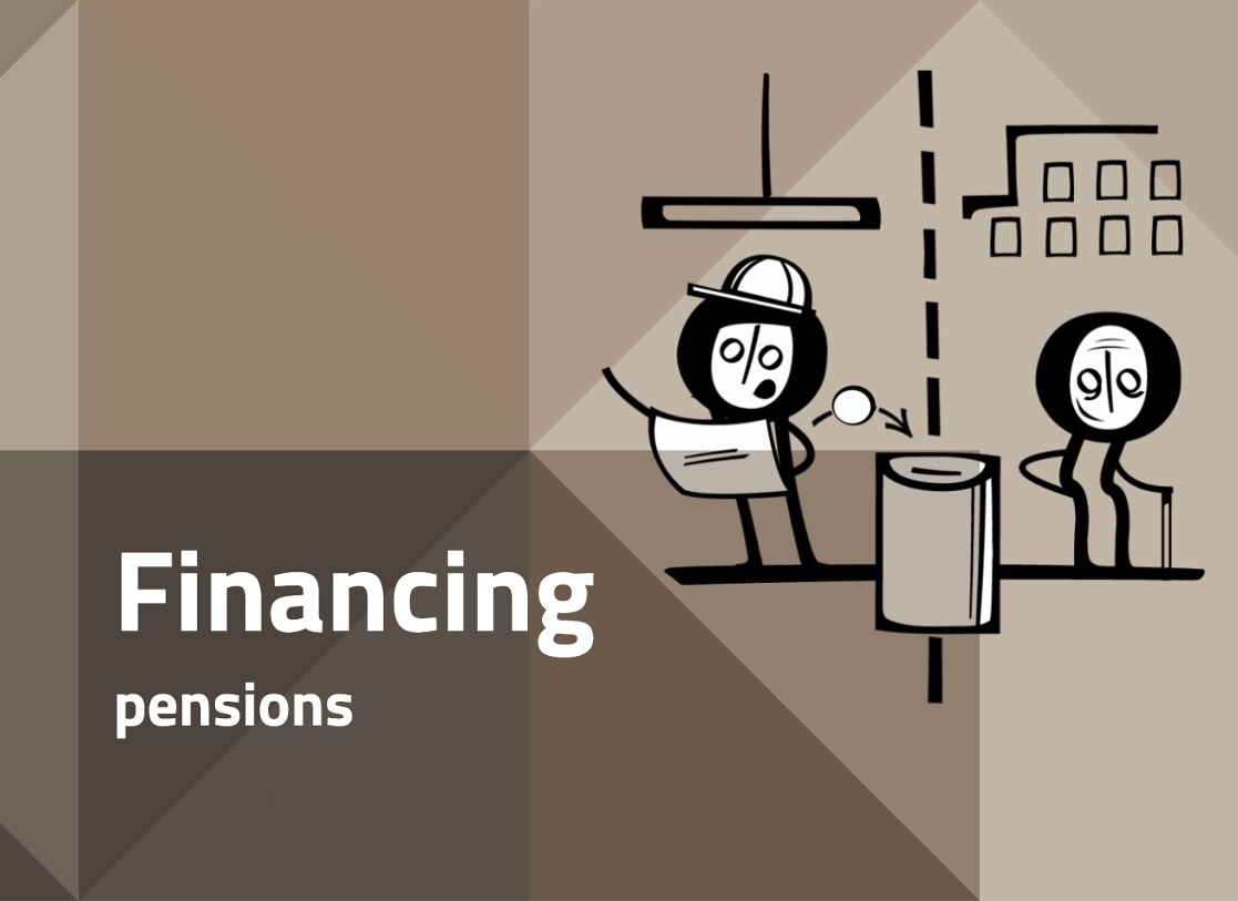
The City, The keys of the economy, Regulations, Pensions
Financing pensions
-

The keys of the economy, Players, Businesses
A game (in French) for learning about economics
-
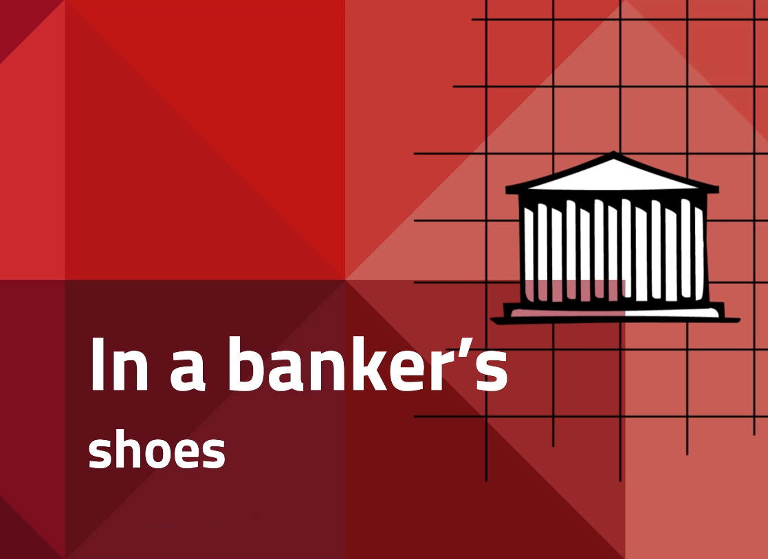
The City, The keys of the economy, Players, Banks
Discover our new game: In a banker's shoes!
-
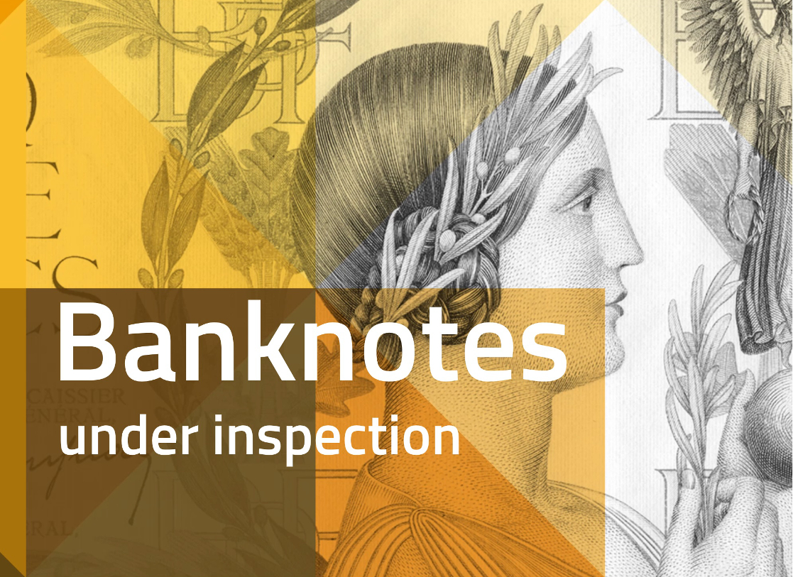
The City, Resources, The keys of the economy, Treasures, Banknotes and coins
Banknotes under inspection
-

The City, Resources, The keys of the economy, Treasures, Banknotes and coins
Coins under inspection